

War and Peace (2016) is one of the bigger TV costume miniseries to air in a while. It stars Lily James in the famed lead role as Natasha, historical manic pixie dream girl who grows up and gets serious, James Norton as her hunky love interest/soldier, and Paul Dano as her steadfast friend. We Americans were lucky in that unlike usual, we got to see this series only a week or two behind our British friends (usually we have to wait a year or so)! We recapped every episode, and those who followed along will note that there was lots to praise, but also lots to snark.
I thought it would be useful to do a round-up post where we boil down what the series gets right and wrong, costume-wise. Because as per usual, most media reviewers (who don’t know that much about the history of fashion, and that’s okay, it’s not their job) have praised the costumes (luckily The Telegraph gets us AND gives a shout-out to Frock Flicks!). So, let’s break things down and talk about what worked and what didn’t in Edward K. Gibbon’s costume designs from a historical lens.
Now, we’ve noted before very clearly that we realize that not all filmmakers (including costume designers) WANT to create historically accurate designs for their productions. And in the case of War and Peace — no, the filmmakers were not necessarily trying to be 100% Historically Accurate. Costume designer Edward K. Gibbon said, “It was a huge responsibility to honour the amazing writing. We didn’t want to reinvent the period, but we did bring something modern to it. It’s a very modern piece.”
That being said, we’ve also explained that we think it’s fair to examine a historically-set story through a historical lens — both because if it’s purporting to show history, then that’s something the filmmakers have put out there; and also, because freedom of thought and speech and anyone can talk about any damn thing they want to. So, onwards!
Historical Accuracies in War and Peace
To be fair and balanced, I feel like I need to point out some of the things that the production got right from a historical angle:
5. Wigs on Servants and Older Men
Wigs on servants in the 19th century is a pretty well established trope, but it’s based on history. This extended to Russia; Natasha’s Dance: A Cultural History of Russia references the Selivanov family, whose enormous staff in the 1810s included footmen who wore green uniforms, powdered wigs, and special shoes made of horsehair (and who had to walk backwards out of the room).
So seeing servants like this guy, in his fabulously trimmed uniform and grey wig in an 18th-century style, makes my little heart happy.

Although it’s not really something that we commonly see on screen, elderly European men did continue to wear wigs through about the 1820s, something I touch on in my own book, 18th Century Hair & Wig Styling.
In the film, Prince Bolkonsky is the only non-servant to wear a wig — usually for formal occasions. In reality, there should be a few more, but I’ll take what I can get!

4. Oversized Collars and Lapels on the Men
Oversized collars and lapels, usually standing but sometimes folded over, are one of the key details of 1800s-10s European men’s fashion. And it’s hot. Check out this compilation of portraits of Russian men from these decades and you’ll see huge collar after huge collar. Rowr.

And yes, they got this spot on in all of the men’s costumes in the show:

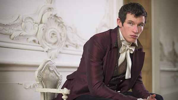


For the above yellow waistcoat, the Daily Mail tells us:
‘Tom showed me this painting very early on in our prep period. For both of us it says a lot about how we wanted the clothes on this production to appear,’ says costume designer Edward K Gibbon. ‘As well as speaking to us both of Andrei, there is also something startling about its modernity and timelessness.
‘It is not a formal straight-up portrait of the period, but rather a much more relaxed painting, almost a snap shot of a man which seems to capture the essence of his character. We both felt that this was what we wanted to try to achieve with the way we dressed our characters. We both love the yellow. It was a very Russian/ Eastern colour that helps to distinguish our world from the pastel comforts of English drawing rooms.’ (From canvas to camera: Beautiful paintings from Tolstoy’s time reveal the inspiration behind the mesmerising costumes and sets on BBC’s War And Peace)
3. Orientalism
Adam Geczy’s Fashion and Orientalism describes how Orientalism in European fashion can be traced as far back as the Greeks and Romans. More to the point, “It was in the first decades of the nineteenth century, spurred by the migrations and collisions of the Napoleonic years, that fashions became obsessed with national signage [ie named and designed after other countries and regions]…”
This element was key to the designs of War and Peace. Designer Gibbon told The Telegraph, “The main thing for me was that it’s not an English story, it’s — it’s this vibrant, exotic world. They loved crazy colour combinations, for example, so it was really important to get those influences in” (War and Peace: on the set of the BBC’s epic Tolstoy adaptation). I will be pedantic and say that Russia is only an exotic world if you live in elsewhere, and that exoticism and Orientalism in fashion was huge across Europe.
Nonetheless, I give them props for all of the Middle Eastern and Asian references in the costumes:


Apparently the inspiration for Dolokhov’s Persian outfit came right out of the book. Gibbon told the Daily Mail, “Tolstoy is fairly explicit in describing Dolokhov’s entrance to the opera and this portrait of Lord Byron supplied the starting point… Although he is described as wearing Albanian dress, Persia and Albania had many links at the time. The dark and dangerous romanticism of [the portrait of] Byron [on which this costume was drawn] also seemed a good match for Dolokhov and his hell-raising antics” (From canvas to camera: Beautiful paintings from Tolstoy’s time reveal the inspiration behind the mesmerising costumes and sets on BBC’s War And Peace).

2. Lounging Wear for Men
Geczy’s Fashion and Orientalism again tells us, “By them middle of the eighteenth century, orientalist costume and dress was, among other things, an outward sign of an expanded and freewheeling consciousness. It coalesced into one single item, the banyan, or banian, the paragon of male informal dress resulting in the robe de chambre, English morning dress, and the smoking jacket.”
Count Rostov is pretty much the only character we see in this attire, but in some ways that makes sense, because we almost always see him at home, and he’s clearly of the freethinking variety. His tasseled cap, another item worn at home (and which had the function of keeping your head warm), is a popular item of the era that signifies Orientalism.


1. Military Uniforms
Most of people that know their military history seem to be pretty pleased with the uniforms. I know nothing about such boy things, so all I can say is that they were sure purdy and I enjoyed watching them.
According to the Telegraph‘s interview with Downton Abbey’s historical advisor, who weighed in on War and Peace,
“The historian said that the Russians changed their uniform regulations three times during the period in which War and Peace is set, but the BBC adaptation featured just one kind of uniform. “It’s a real nitpicking point,” he said. “But people like me notice these things. It is very obvious to someone with even a fleeting interest in Russian dress.” Prof Lieven said he had made the corporation aware of the changes, but the expense of creating a number of different uniforms for each cast member would have been prohibitive. He said: “There are limits to what you can do. Uniforms sometimes changed right down to individual regiments. It would have cost a fortune.” (Downton Abbey historical advisor bemoans ‘baffling’ War and Peace costume error)
And now here’s where all the haters can relax: I will absolutely let this slide because yes, the idea of making multiple different uniforms for all the cast members gives me palpitations. So long as they got at least one iteration right, I’m good. Also, shiny.


According to knowledgeable commenters on our Part 2 recap, there’s some questions about Andrei’s white and silver uniform that he wears to the Tsar’s ball. All I can do is give you the designer’s thoughts on this costume: “I think probably Prince Sanjay’s [sic – I think they mean Andrei] ball costume was one of the highlights for me. It’s all beautiful handmade embroidery that was done in Poland. It’s a very traditional form of metalwork embroidery” (Russian Dressing: Edward Gibbon on Creating the Look of ‘War and Peace’).

Historical INaccuracies in War and Peace
But yes, there were a lot of these. We had fun mocking them in our recaps, now let’s talk about why.
5. Bangs*
* Yes, I know it’s a “fringe” in the UK, but unless you’re going to correct me with the Russian term, silencio. I’m American. I use American terms. Deal!
I think we covered the problem with this pretty well in our infographic:

The filmmakers were trying to make Lily James look young: “‘Our Natasha is 15 at the beginning, although she’s 13 at the very beginning of the book,’ says Jacqueline Fowler, the hair and make-up designer, ‘so I tried to make Lily James [who’s 26] look younger by giving her a fake fringe and loose, soft curls to make her look more girly [above]. I gave Lily natural make-up with no definition and used blusher on her cheeks to create a puppy-fat look. The whole point of Natasha is her innocence and beauty'” (From Russia with lust: As the BBC’s racy new War and Peace begins cast and crew tell all about the TV event of 2016).
Maybe they experimented with other hairstyles and couldn’t get this same youthful effect. And given that this looks like a wig, it’s possible that they were using the bangs to hide her obvious wigline (although small tendrils or a lace-front wig would have solved that). But this just looks SO clunky and wrong when seen through an Empire/Regency/early 1800s lens. If they could have curled them, or made them slightly wispier, or brushed them to the sides/one side, they would have been fine. This looks like something a schoolgirl would wear c. 1950:

The good news is that she’s the only character to have them. Most everyone else who does has small curled tendrils brushed to both sides, as was worn in the period:

4. Questionable Fabrics
No, not everything. But there were some real clunkers. For example…
The odds of anyone being able to achieve this bright of a turquoise in this era is slim to none:

Here’s the closest I can get using the Powerhouse Museum’s Electronic Swatchbook for 1837 (note: 20 years later, so theoretically technology has advanced):

Next up are Helene’s super sheer dresses. Veronica Isaac, assistant curator at the Victoria and Albert Museum, sums it up best when she suggests to The Telegraph that the production could have used “Good quality muslin, which was popular in the early 1800s [and] is sheer and clingy. It leaves nothing to the imagination. Instead they’ve gone for synthetics in colours that strike a very fake note” (The BBC’s War and Peace costumes aren’t historically accurate, but who cares?).


Next up are the satins that just read synthetic. Are they? I have no idea. But they ping my “Casa Collection” antenna.


Note the lavender stunner above includes a sheer georgette drape. While sure, this fabric may have existed under a different name in an earlier era, I give you Google’s stats on the use of the term “georgette”:

Finally, I present to you NOT IN ANY WAY SHAPE OR FORM 19TH CENTURY. I can’t even compare it to any 19th century prints because it’s so ridiculous.


3. Bias
Oh, Helene. The filmmakers wanted to convey her character’s key traits (Slutty McSluttiness) through costume, and here’s how designer Gibbon approached it: “Helene is very decadent and gives the impression that she is going to wear a dress once and it’s going to be abandoned on someone’s bedroom floor. She has incredible sexual confidence. And Tuppence gives it everything she has got. Her clothes look as if they are about to fall off her back and we played with that and tried to accentuate it” (Is Tuppence TV’s naughtiest star? Bed-hopping antics of War and Peace’s outrageous Helene (and her SEVEN lovers) have shocked viewers… but they haven’t seen anything yet).
I don’t have a problem with using costume to try to make Helene look sexy — costume showing character is key! The problem is that they did it in part by using bias. For those who don’t sew, here’s what you need to know: fabric is strongest and least stretchy when cut on the “grain” or “cross grain” — when you line up the direction that the fabric hangs with the direction of the woven fibers. If you turn that line to a diagonal, the fabric becomes drapey and stretchy.

Why is this a problem? Costume Close-Up: Clothing Construction and Pattern, 1750-1790 explains it to us: “Certainly the extreme waste of material that results from cutting bias binding would have been unacceptable in the 1700s
What Helene is wearing in War and Peace is straight up 1930s.


Again, I shall let our infographic explain things:

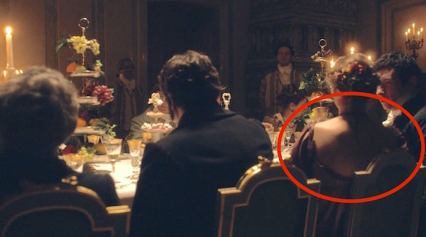
2. Backless, Shoulderless, and Assymetrical Dresses
The very late 1790s and early 1800s were indeed an era of sheer, sexxx-ay dresses, primarily due to the shakeup of the French Revolution. However, that doesn’t mean that any of the dresses worn in this era, even by the most fashion forward of merveilleuses, were 1) backless, 2) shoulderless or strapless, or 3) asymmetrical in terms of bodice straps and sleeves.
If Caroline Bingley in Pride & Prejudice & Pigs (2005) is anything to go by, I will inevitably get in a fight with one or more readers who LURVE War and Peace and will try to tell me that “French merveilleuses totally wore slutty outfits like these!” So I went out and tracked down a bunch of images of slutty sluts* from the late 1790s through the mid 1810s from France (the leader in terms of slutty slut* dresses) and Russia (the country in which this series is set) to compare:
* I am joking. They wouldn’t have been considered slutty sluts in their era, rather sexy, risque, fashion-forward women.

Do we see boobies (and even nipples)? Yes. Low necklines? Yes. Shoulders? Very occasionally.
Do we see strapless? No. Do we see dresses with ribbon straps? No. DO WE SEE ONLY ONE SHOULDER COVERED AND THE OTHER ONE SIDE STRAPLESS? NO NO NO.


And what about the backs of dresses? Do we see backless dresses in the period? No we do not.

So then that’s why this gives me an eye twitch:


1. No Corsets
The key source on this is Norah Waugh’s Corsets and Crinolines, which tells us, “At the beginning of the nineteenth century the Grecian figure — the natural figure (high rounded breasts, long well-rounded limbs) — was the ideal every woman hoped to attain. Her soft, light muslin dress clung to her body and showed every contour, so all the superfluous undergarments which might spoil the silhouette were discarded — among them the boned stay… There are, however, so many references in English and French writings of the time, both to the use and disuse of stays, that it may be presumed that both styles held good, and the young girl, or the woman with a beautiful figure, did indeed discard her stays.” She then goes on to explain how the bodice lining could be used to control the breasts, as well as wearing long, knitted garments.
I’m not sure about all the characters, but I can tell you that Marya did wear a corset while Natasha and Helene did not. The actress who played Marya told Harper’s Bazaar, “To get into her character’s oppressed mindset, ‘I always wear a corset. When times are worse it’s tighter. When Marya’s feeling able to be free it gets looser. I used the structure of it to help me'” (War and Peace: A Story for All Time). However, according to actress Lily James (Natasha), “I didn’t wear a corset because it wasn’t the fashion back then and I loved the long flowing dresses — there’s so much freedom” (From Russia with lust: As the BBC’s racy new War and Peace begins cast and crew tell all about the TV event of 2016). At which I scoff, not at James, who I’m sure is just parroting something someone told her, but at the filmmakers who decided to rewrite history.
The problem is how the various actresses look on screen. Poor Marya’s dresses just plain don’t fit her in the bust, so she’s harder to evaluate:

Lily James as Natasha has a decently lifted and rounded look:

The real problem here comes with Helene, whose character is slutty and whose wardrobe, therefore, consists of multiple sternum-baring, inner boob displaying dresses.

The problem is that the kind of breast silhouette that Helene sports would have been viewed as droopy and flat (and ugly) in the period. Note again Waugh’s description of “high rounded breasts [emphasis added].” You don’t see ANYTHING like Helene’s look in period sources. Check out the slutty slut images above, and you see high, full breasts. The desired look was far more what we show in our infographic:

Okay, let’s do this. War and Peace (2015): What’s there to praise? What can we censure?


Ugh, re the whole “No stays” thing and Lilly James’ reasoning for not wearing one: SHE WAS IN P&P& ZOMBIES–set in the same period and in which all (or most of) the women in the film–INCLUDING James–obviously WORE STAYS. I just….*bangs keyboard*
oooh that last bust shot- we had a phrase for it – t**ts in a bag. *shudder*
I think the thing that bothered me the most (other than whatever was going on with Anna Pavlovna Scherer and Helene) is that they couldn’t bother to fix the fit of Marya’s clothes. Maybe this was intentional to make her look dumpy? It wasn’t just her though. Often the bust line was wonky on the other women as well.
Thank you for your most scholarly article. Would love something like this at CostumeCon.
I also believe Ms James was parroting someone, maybe Mr Gibbon. But it makes her, a very intelligent woman, appear and sound bimbo.
I hated the inaccuracies especially in the choice of fabric and cut, no undergarment support, aka corsets, and the fringe on Natasha. Looked like a 1960s hippie.
What I did love were the ‘chicken hats, men’s uniforms and scenery.
Ignoring the terrible costuming choices, is it worth watching? I haven’t read the book or seen any other adaptations so I’m really unfamiliar with the story. Does it suck you in and make you excited for the next episode?
I hadn’t read the book or seen any other adaptations but each week I was excited to watch the next episode.
Tough call for me! It was certainly better acted than the 2007 version (although 2007’s Andrei was WAY HOTTER, but then I love dark-haired men). It’s certainly no Pride and Prejudice! I guess I’d give it a B for drawing-me-in?
Despite the military costumes being good in general, someone pointed out that an anti-France/Nappie character was wearing a Nappie-bestowed medal/award, something the character would never, ever, ever do. It was a small blunder full of epic fail, like depicting Prince Charles with a Nazi armband or something. Not gonna happen.
Yeah I read about that and laughed, but I’ll say that it was a minor character and a minor costume element. It’s not like Prince Charles was wearing a full Nazi uniform.
Don’t believe it was Prince Charles, think it was Prince Harry
I just feel sorry for Gillian Anderson. Her clothes are awful, and the hair and makeup is doing her no favors.
Also I think “There were only 6 episodes is not a viable excuse. The Masterpiece Pride and Prejudice was also a miniseries and had decent Regency costumes.
Thank you so much for all of these recaps. I surprised myself with my annoyance about the costumes; I was so infuriated that I decided to read War and Peace instead of muttering my way through the rest of the BBC series. Finding your site made me so happy because you shared my pain! (You were much funnier and more knowledgeable about it too.) Keep up the great work/snark!
I’m glad I’m not the only one who decided to read the book after seeing the series. It also meant I could snort meaningfully when I got to the bit where Pierre falls for Helene over the creak of her corsets.
Very much enjoyed this – learning so much from you. Can I ask – how did you manage to search Electronic Swatches by date AND colour? I can only get either/or.
Choose a date, and THEN choose a color from the color palette!
I’ve just discovered this website and the article so am late to comment, but if anyone is still reading….
I so agree with the judgement about the inaccuracies in the costumes. What annoys me is that even though it was deliberately done to illustrate character, etc. that could have been achieved with use of accurate costuming and hair. Not doing that just shows that the costume designer considered himself to be above his subject matter, a bit of a cheek when your subject matter is Tolstoy!
The BBC dramatised War and Peace way back in 1972, with Anthony Hopkins as Pierre, and the costuming in that version was much better and more accurate. The actess playing Helene knocks Tuppence Middleton into a cocked hat for portraying sexiness in an 18th century way. In fact her costumes were so revealing that I’m not sure they could be used in a modern-day costume drama.
One other thing that gets on my nerves with many costume dramas now is… eyebrows! So many female characters are 18th or 19th century from the neck down, but their eyebrows are resolutely 21st century. Our modern day eyebrows out of the brow salon are very definitely of our time, and they just look wrong when coupled with a crinoline or a high-waisted grecian dress. This irritates me so much that I can’t watch many series that I would otherwise enjoy. War and Peace was not too bad for this, although I think Gillian Anderson was a bit too 21st century in the eyebrow department.
I don’t know about the eyebrow thing. I’ve been accused of shaping my eyebrows since early childhood, and I’ve never touched them!
My entire Eastern European (mostly Ukrainian) family has eyebrows that look “salon-sculpted” to many, and this IS set in Eastern Europe…
EXCELLENT article–just the kind of movie-design-breakdown I’ve been looking for! And kudos to you for going deeper by pointing out the highlights as well as the lowlights.
What a brilliant site! I had started to wonder if I was the only person in the world who could get put off an adapation by appalling costuming. I thought the men’s clothes in this where on the whole great and the male actors very well cast. The women… meh. My girlfriends have banned me from watching period dramas with them after my shrieking “Time machine… time machine…” at Helene and crying over Marya. Re the backless dresses though… Tolstoy does describe someone, I’m sure it’s Helene, wearing a low backed dress. I’m guessing they were in fashion when he was writing so possibly the costume designer took it from that. I’ve come across a lot of people who were really surprised to learn W&P wasn’t written at the time it’s set. Anyway, keep posting, this site is too good!
TF?! Was David’s Bridal having a sale so the costume designer was just like “Why not?” If so no, bad costume designer! No biscuits for you!
I know I’m a bit late to the party here but this has confirmed all my gut feelings about the costumes. I don’t know how any seamstress or seamster could stand to see their work so badly fitted to the actors. Also, as beautiful as Prince Andrei’s white ballroom suit was his epulettes looked terrible. Did they really sag off the shoulders like that? Also I hated that you could see the red lining it made it look pink. Could someone tell me if interlining was used during this period. Many thanks.
I’m late to the party and I’m not sure if this is the right way to do this but these all made me think of this post and this movie’s (horribly incorrect) costumes and I felt like this would be the one place that would understand:
http://historicalfashion.tumblr.com/post/523952870/beribboned-ball-gowns-1807
http://historicalfashion.tumblr.com/post/70815898920/dawn-barthelemy-wife-of-general-dejea-by-robert
http://historicalfashion.tumblr.com/post/52921759443/dress-worn-by-empress-josephine-1800s
http://historicalfashion.tumblr.com/post/52921759443/dress-worn-by-empress-josephine-1800s
http://historicalfashion.tumblr.com/post/39129227766/historicalfashion-charlottecorday-titam
http://historicalfashion.tumblr.com/post/39065261104/historicalfashion-madame-tallien-by
Ah, Andrei’s white and silver ‘Prince Charming’ fantasy uniform, which bears no relationship whatsoever to any uniform ever worn in the Imperial Russian Army. (I love that the costume designer actually calls the character ‘Prince Sanjay’ – it does look very Bollywood.)
It infuriated me every time I saw it in the trailers and promo material – ‘NO, NO, THAT’S IDIOTIC!’
It baffled me during the first couple of episodes, when Andrei and every other soldier character was wearing pretty passable uniforms. You could pick holes to be sure, and the fit not always great, but on the whole, not bad. So, I kept saying, ‘If they could get it this reasonably right, why that monstrosity?’
But actually after seeing the ball scene – which is the only time Norton wears this fantasy costume – I think I get it. I think it really is meant to be literally a ‘Prince Charming’ outfit, because what Natasha is seeing is certainly not the real Andrei – who with all his virtues is also ambitious, egotistic, a bit priggish, still under Daddy’s thumb, and has all the emotional insight of a flatfish – but her romantic hero, her handsome prince.
What still does make me giggle every time I see that big promo picture, however, is that they obviously didn’t get a sword-belt made for it, given that it was only going to be worn without a sword. But on the day the publicist or whoever must have said “But Andrei has to look BUTCH and MANLY! He needs to wear macho boots, not silk stockings and pumps! And he needs a SWORD to clutch* the hilt of!” . So they got him a sword, and rootled round and found a thick, clumsy, dirty leather sword-belt, and they didn’t even bother to fasten it snugly so it would sit neatly round his waist without sagging, or even paint the bits that showed with tennis-shoe white – they just slung it saggily round him, still grimy.
*Period deportment note: in RL it would actually have been a HUGE faux pas for an officer of the period (or indeed at any time that officers wore swords) to clutch at the hilt of his sword. He was used to wearing it so he didn’t need to hold it to keep it out of the way; he only did so when he meant to draw and use it (or at least was tempted to do so). I think the reason you see officers in BBC productions doing this so often is that whereas the authentic sword-belt of the period allowed the sword to hang vertically down the left thigh, nicely out of the way, a whole string of Jane Austen and Vanity Fair productions have hired cross-belts and swords from suppliers whose belts were modelled on the redcoat bayonet-belt of the period, like this, http://www.re-enactmentsupplies.co.uk/index.php?route=product/product&product_id=218, which was designed to leave the bayonet hanging at a slant. But while a 17-inch bayonet hanging behind you at a slant is no great inconvenience, a 32-inch sword certainly is! So the actors constantly had to clutch their hilts to stop their swords banging into the scenery; directors and actors got used to seeing them do it; and it has become something they feel is period-correct (and MANLY!) to do, even when they aren’t worried about clouting something.